Over here! No...here! Over HERE!
Check out my new website and blog at www.lauranuttall.co.uk
This blog is now closed for business, but I'd love you to join me at the new party. You can sign up using Google Friend Connect here.
See you soon!
Laura
Wednesday, 27 October 2010
Thursday, 16 September 2010
Follow me.....
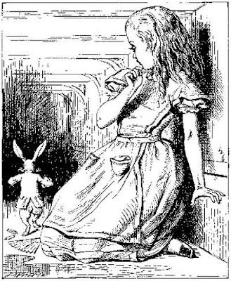
....down the rabbit hole to my new and improved website!
Thank you so much for following me here at Blogger.com, I have appreciated all your support and wonderful comments. You can find all my old posts and exciting new stuff (I promise) over at my new site www.lauranuttall.co.uk
To go straight to my blog and the latest post click here!
You can sign up to follow using the Google Friend Contact widget on the right-hand side of the page. Please do come with me!
This site will stay but all new posts will be on my new site. I look forward to seeing you there.
Laura xxx
Monday, 6 September 2010
Susan!
So, as part of the mini 4 Week Challenge for Zero2illo (which will probably end up taking me 4 months) here is Susan, completed in gouache and indian ink. We've been asked to blog our progress, so here she is from conception to completion!
Preliminary sketch:
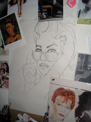
Note the Scary Monsters album cover, oh how I LOVE this cover art. A big inspiration, let alone Bowie himself.
Photoshop sketch to establish colourway:
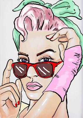
This is probably the first time I've been this organised with preliminary stuff. But it really helped and saved time and frustration in the long run. If only my art teacher could see me now...along with my penchant for outlining everything which he hated, I was always marked down for my lack of prep. Finally sir, I've learnt the error of my ways.
Taking brush to paper:
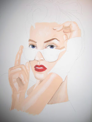
Adding colour and detail:
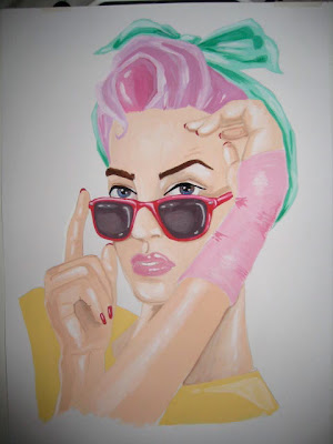
And finally, the outline:
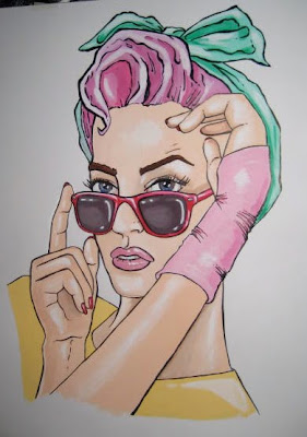
I've had to take this picture at a slight angle so as to avoid glare from the ink outline. Hopefully I'll get a lovely clean scan soon...once I find an A3 scanner.
Preliminary sketch:

Note the Scary Monsters album cover, oh how I LOVE this cover art. A big inspiration, let alone Bowie himself.
Photoshop sketch to establish colourway:

This is probably the first time I've been this organised with preliminary stuff. But it really helped and saved time and frustration in the long run. If only my art teacher could see me now...along with my penchant for outlining everything which he hated, I was always marked down for my lack of prep. Finally sir, I've learnt the error of my ways.
Taking brush to paper:

Adding colour and detail:

And finally, the outline:

I've had to take this picture at a slight angle so as to avoid glare from the ink outline. Hopefully I'll get a lovely clean scan soon...once I find an A3 scanner.
Wednesday, 25 August 2010
Working on a new pic....
Thursday, 29 July 2010
FUSE screening at The ICA
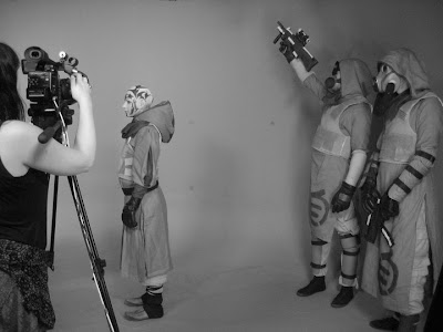 Photo taken during shooting in the green screen studio, check out the Fuse Youtube channel for a short video explaining how the film was made.
Click here to check out the Fuse channel on Youtube, where you can see the trailer. Exciting times!
Tuesday, 27 July 2010
Digital doodles....
This image, called 'Smile, Baby', started life as a collage but I thought I'd tinker with it to see how it looked with really flat areas of colour.
Here's the original - the scan shows up the black outline as fainter than it actually is. I really like the fact it's slightly off-register as I was going for a screen-print effect.
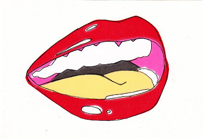
And here's the digital version. I love the vibrancy if the colours and the crispness of this one, but perhaps it's lost a little 'soul' along the way...?
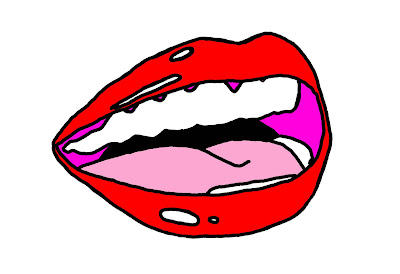 What do you think?
Monday, 26 July 2010
Playing with Photoshop!
So I've finally made my foray into the world of digital images! I've played around with Photoshop before but this is the first time I'm dedicating time to learning it properly.
Here's an idea I came up with after reading a book on Art Nouveau, I was inspired by the use of bones and organic forms.
The initial sketch:
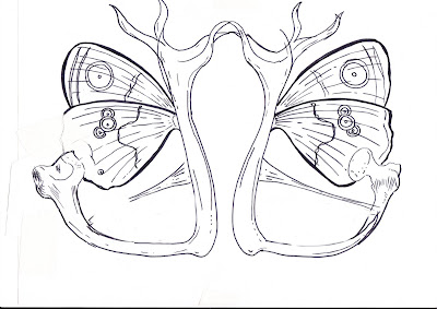
And here it is after a little tinkering on Photoshop:
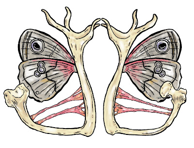 It's still pretty sketchy, but even after just working on one image I'm much more confident with the software. And I really love the creepiness of this image! What is it...???!
Here's an idea I came up with after reading a book on Art Nouveau, I was inspired by the use of bones and organic forms.
The initial sketch:

And here it is after a little tinkering on Photoshop:
 It's still pretty sketchy, but even after just working on one image I'm much more confident with the software. And I really love the creepiness of this image! What is it...???!
Subscribe to:
Comments (Atom)


